Sunday, January 31, 2010

Hammock Earth; comparing sea levels of the Eemian to the Holocene

I just finished reading Kopp et al's "Probablistic assessment of sea level during the last interglacial stage" and the excellent News and Views summary by Clark and Huybers. Both articles appeared in the 17 Dec. 09 issue of Nature. The illustration on the left is my greatly simplified analogy of Kopp et al's effort to assess how the redistribution of mass from icesheets as water during the Eemian affects proxy measurements of sea level. Just as pillows of ice at each end of a hammock would change the hammock's shape, so too would icesheets and their loss affect the shape of the global ocean basin. If "hammock earth" becomes a usable term, I expect full credit or ridicule for coining it.
Below is a summary of their work, comparing their assessment of sea level to today's. Both articles compared the warmer Eemian temperatures to comparable temperature increases expected from current and expected increases of greenhouse gases. Missing from my diagram is a clarification that sea levels rose at perhaps 65-90 cm per century to the estimated 6-9 meters above current sea level.


(update 5/6/10: revised sketch)
The warmer Eemian climate is linked to greater northern hemisphere insolation as a result of an orbit with greater eccentricity and precession that placed the northern hemisphere solstice close to perihelion. Below, I'm comparing Earth's orbit at the Eemian with Earth's current orbit. These diagrams are for illustration; they are not to scale. I created them using my orbit viewer.


A potential sea level rise of up to 9 meters, suggested by Kopp et al, is disturbing, especially because the author's don't rule out periods of a higher rate of change that the 62-90 cm per century. For me, the observation that CO2 levels didn't rise beyond the Holocene's pre-industrial levels is intriguing. CO2 and methane from a warming biosphere is part of a worst case global warming scenario. I wonder if the Eemian shows that we have a 2-4 C grace period before this feedback kicks in.

jg

Monday, January 25, 2010

On Reading Hansen's Storms of My Grandchildren


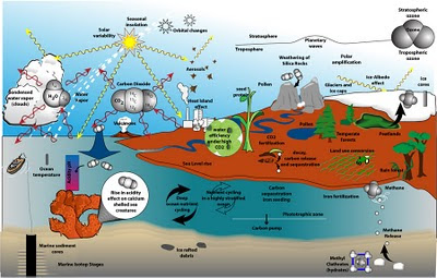
Before reading Storms of my Grandchildren, I had confidently told a few friends that a Venus style run-away greenhouse effect was not a realistic expectation from even the most excessive fossil fuel use. Hanson's book was a delightful read, in that I recognized a lot of the scientific literature he is drawing on, but he made connections between stellar evolution, paleo-climate reconstructions, and unknowns about the endurance and long-term reliability of carbon sinks that disturb him. If these variables disturb James Hansen, I felt it was worth a picture. I've tried to add a few other elements to the picture, including a redrawn CO2 level from Richard Alley's recent presentation an the AGU: CO2, The Biggest Control Knob.

Tuesday, January 19, 2010

Some desert for my friend...

... who's never seen the desert (and also for everyone else on the web):


Above: A backlit view in Joshua Tree National Monument (click to enlarge)

Above: A typical view of Joshua trees (well, the best I had that I thought typical)

Above: Can you see a face in the rock? I guess it depends on whether you're a human or a fish.

All photos taken on 10 Jan 10 at Joshua Tree National Monument in Southern California. I raised the saturation level on the first two to compensate for dull computer monitors.
jg

Sunday, January 17, 2010

Photosynthesis, respiration and yearly CO2 levels

A letter in the Californian (Global Warming Myths Continue 1/13/20) reminds me of a set of illustrations I created last year comparing natural, yearly fluctuations of atmospheric CO2 to the yearly increase due to humans (e.g., fossil fuel use, deforestation). I had included it in my Earth, Orbit, Climate powerpoint presentation but took it out of my online version because 1) it was a little off topic and 2) my perception of a need for clarity on this subject was based on anecdotes: vague recollections of coworker's citing that human activities are small in comparison to fluctuations in nature. It didn't seem like it was a current denialist talking point.

The letter writer, whom I support, speaks to confusion between variability in CO2 levels and the steadily rising average level. He addressed this topic in response to letters from my community (that I missed) . My experience tells me that if a letter writer denounces global warming and cites something like natural flucuations exceding manmade, then there is a "think tank" out there providing these talking points. So I thought I'd resurrect these illustrations.
Below is a redrawn version of atmospheric CO2 levels and a closeup of the yearly cycle.


Here's a blow-up of one year:


I emphasize that this is an illustration that I drew from a plot of the data, but I didn't plot the data (another project). It is my impression from the graph I used as my source that during a year, atmospheric CO2 level fluctuates by 6-7 parts per million while the average, largely a result of human activities, rises 1.5-2 parts per million. I believe the talking points I refered to are using the size of the yearly fluctuation to show that it overwhelms the anthropogenic increase. (I'm keeping an eye out for this talking point, and welcome any pointers to a reference making this argument.)

What causes the yearly fluctuation?    
Here is the yearly cycle shown with an illustration of the seasons.


The top panel is the yearly CO2 level and the bottom panel shows the seasons at northern latitudes. From left two right: Bambi eating bark from dormant trees, converting the carbon into CO2. Spring comes and though Bambi still eats and exhales CO2, the trees and grass are absorbing CO2 and converting it to plant matter (as mostly cellulose?). By late summer, many forests dry out and taper off their uptake of CO2. Autumn marks a great reduction in photosynthesis accompanied by decay (which I believe also releases carbon to where it can be devoured by microbes that release CO2). And last vast areas are frozen, allowing the animal life to exert a dominate influence on atmospheric CO2 levels.

It's reasonable to ask whether the southern hemisphere offers some cyclic behavior that compensates. (I suspect that it complicates measurement rather than compensates--yet another topic to explore.)

Below is a comparison of the two hemispheres:


If I understand correctly, the disparate distribution of land masses at latitudes that respond to seasonal change with significant changes in vegetation are what create the yearly cycle in atmospheric CO2. I do not know what happens to the southern hemisphere's oceans as summer comes and goes there.

The long-term CO2 levels have fluctuated without humanity's help. Climate modes, like El Nino can spur the growth of vegetation to pull the long-term trend downward or melting of permafrost can push it upward:


There are many mechanisms that can act regionally or globally, but what I find interesting is the effort to examine how global warming will affect this yearly cycle. A review article and research paper in Nature 3 January 2008 addressed this question by examining the points where the blue curve crosses the yellow, long term line.

I'll be adding an illustration on that when I can. (Update: Illustration is part of this postSeasons, Sinks, and Sources)

jg

Thursday, January 14, 2010

Everything Climate

Almost two years ago I tried to capture everything I'd been reading on climate science in an illustration. I soon abondoned it, learning it was easier to pose questions that describe answers. I just rediscovered it and thought I'd share.


jg

Tuesday, January 12, 2010

Taking Trenberth's illustration out of context

Unfortunately, Kevin Trenberth will be remembered by those with no understanding of climate science or science in general for his "travesty" quote. I'll remember Trenberth for this diagram, which is commendable for the depth of research behind it as for the simplicity of expression. I'm sharing it here so I can link to it at the dailycamera, Guest opinion: The truth about carbon dioxide, climate and the weather

Click the picture to see the whole picture.

Update 1/14/10: A statement by Kevin Trenberth is available at the UCAR website.

Thursday, January 7, 2010

Carbon Reservoirs

The following diagram is redrawn from Nature, 19 Oct 2000. I'm posting it here to facilitate a discussion on More Grumbine Science on CO2 and Temperatures for 800,000 years.


Sunday, January 3, 2010

Circumzenithal arc, again


Jet contrails are thought to suppress the diurnal temperature change by about 1 degree C. This morning, the conditions were right to maximize this influence, for it would have been a cloudless morning except for the contrails from jets to and from Los Angeles. The photo on the left shows a contrail becoming feathered. The sky was full of these feathered contrails that when they drifted overhead would create the arc shown above. My observation is that contrails make poorer arcs. The fluffiness of contrail-induced cirrus clouds reduce the clarity of the bands of color.

jg